The Winter Olympics start today, and as I am writing this I can hear the cheers from the crowds on the street outside my office and the hum of helicopters overhead. Exciting times. The city all a buzz and full of people from all over the world. I live and work downtown, so I will be able to walk to all the activities. I am sure a lot of you will be glued to your TV rooting for your Countries.
This YouTube video is amazing. Sometimes I forget just how beautiful my city is.
Jumat, 12 Februari 2010
Vancouver Winter Olympics
Selasa, 09 Februari 2010
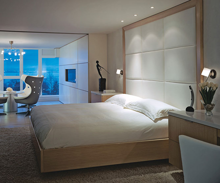
Reinventing Blue
And I mean a deep, dark, luscious Blue. It is showing up in walls, fabrics, carpets and accessories. It is a blue that doesn't have green or red in it. It is almost black and is warmer than lighter blues and has more life and depth than Black. It is the deepest shade of Indigo as seen in Ikat Textiles. It is the color of the sky on a moonlit night. It is mysterious, moody, classic, timeless, calming, and refreshing. It can have a glossy finish or be totally matt. It is beautiful when contrasted with pure white. My favorite Benjamin Moore paint colors are Polo Blue, Blackberry Punch, Kensington Blue, Blue Gaspe, Hale Navy, and Old Navy. Some deep blue colors are: sapphire, azure, beryl, cerulean, cobalt, indigo, navy, royal, midnight blue, slate, steel blue, Prussian blue.

The high gloss finish on this wall has a subtle reflectivity to it that changes at different times of the day and literally sparkles at night.

Alberto Pinto has used a deep blue in the bold geometric carpet as his only color in this wonderful Master Bedroom.

A deep and refreshing Mediterranean blue has been used on the walls at JK Capri Hotel in Italy.

A deep "French Blue" velvet for this classic chair.
I am in the process of designing a guest bedroom and I have chosen a deep blue silk for the curtains called Moonlight. I am putting a natural woven raffia roman shade on the window behind the curtains for some textural interest. The walls will be painted the same shade as the silk curtains: Benjamin Moore "Blue Gaspe". The Headboard is a heavy white Belgium linen. The bedding is white Egyptian cotton with an Hermes cashmere blanket in a deep charcoal color on the end of the bed. The carpet is wool and is the color of white coral. I will hang black and white "ocean" photographs that I have taken on my travels on the blue walls to finish it off.
Let me know if these deep luscious shades of blue are slated to become one of your new favorite colors?
Photo Credits from top: Dominio, Alberto Pinto, JK Capri Hotel, Jayson Home.
PATRICIA GRAY INC is an award winning interior design firm writing about lifestyle and
WHAT'S HOT in the world of interior design, architecture, art and travel.
2011 © Patricia Gray | Interior Design Blog™
Selasa, 02 Februari 2010
2010 Color Reform Trends

ABC Carpet & Home Vintage 'over-dyed' carpets
ABC CARPET NEW YORK INTRODUCES COLOR REFORM TRENDS COLLECTION TO SALVAGE OLD RUGS
I got an interesting email from ABC Carpet & Home New York this week, that captured my interest - they (ABC Carpet & Home) is encouraging us to look on the bright side for 2010 with a their new rug collection that promises to: "escape predictability, embrace the unconventional, and help preserve our planet." This new assortment of hybrid carpets called Color Reform, transforms imperfect, vintage rugs into modern works of art. ABC Carpets are literally “...rescuing carpets from the “rug graveyard” and giving them a new lease on life.”
ABC Carpet & Home has utilized this notion to develop the concept of Color Reform, which refers to evolutionary change through color. Each one of a kind rug was individually handcrafted by Turkish artisans in the Toros Mountains. The vintage rugs are neutralized to remove their original color and then over-dyed to create their remarkable chromatic state. The variations in the tonality of pigments result from the carpet’s original concentration of color combined with the dye application process conceived from each artist’s distinct vision.
Exotic rainbow hues range from neon pink and electric green to opulent reds and saturated yellows. The striking compositions evoke an almost translucent appearance as irregular, partially faded motifs emerge through the color, adding complexity and interest to each piece. Below is one of my favourites in the series, in a more neutral color palette, that I think you would be able to live with for many years to come and pass on to future generations.

ABC Carpet & Home Color Reform
Vintage 'over-dyed' carpet
PATRICIA GRAY INC is an award winning interior design firm writing about lifestyle and
WHAT'S HOT in the world of interior design, architecture, art and travel.
2011 © Patricia Gray | Interior Design Blog™
Sabtu, 16 Januari 2010
To Kindle or Not?

The controversy for me is to read a book on Kindle, or to hold a book in your hands? Here is what I have decided. There is a place for both. There are certain books to read on Kindle. For me they are current best sellers that I usually devour, and having read them once they are cast to a separate and less prominent position on my bookshelf. It seems a waste of paper to me to have stacks of books that I will only read once. And another advantage of Kindle is that you can have that book instantly downloaded onto your Kindle wirelessly and be reading with no wasted time (and time is a precious commodity) standing in line at the bookstore or waiting for it to arrive by mail.
The new Kindle DX comes with a larger 9.7” display and I am debating on whether to wait until they come out with a color screen. I discovered that they now have Kindle for PC & iPhone (free download). I downloaded Kindle for PC last weekend and really enjoyed the ease of reading on my laptop. You can turn the pages in a nano second, which is good for speed reading certain types of books and I liked the illuminated screen for reading at night. I have read two bestsellers on Kindle for PC : The Checklist Manifesto by Atul Gawande & Outliers by Malcolm Gladwell – both excellent books.
But then there are books that defy the use of Kindle for me, and those are the books that I want to hold in my hands, smell the pages, turn the pages, start reading from the back of the book, explore the beautiful pictures , arrange them in alluring stacks on my coffee table, line them up as works of art on my bookshelf. There is nothing as delightful to me as owning and reading a precious first edition.

So what do you think – to read a book on Kindle or hold it in your hands?
Patricia Gray is an award winning Interior Designer in Vancouver, Canada who blogs about WHAT'S HOT in the world of Interior Design. 2010 © Patricia Gray Interior Design Blog™
Kamis, 14 Januari 2010
Featured Home 2010 Vancouver Winter Olympics

Architectural Digest's February issue has just hit the newsstands and they have done a special Travel section for the 2010 Winter Olympics and my "Gastown" Project in Vancouver is featured.
Click on above image to see entire project.
To view the slide show on-line click here.
Patricia Gray is an award winning Interior Designer in Vancouver, Canada who blogs about WHAT'S HOT in the world of Interior Design.
Selasa, 12 Januari 2010
Monochrome Interiors

Monochrome is a term generally used to describe painting, drawing, design, or photography in one color or shades of one color. A monochrome object or image is one whose range of colors consists of shades of a single color or hue. I have shown a monochrome interior in shades of white, but monochrome interiors can also be in shades of green, blue, red, etc. I particularly like this Monochrome interior - Blue Fin Restaurant at the W in New York, because of the way pattern and texture were used to give interest and drama to an otherwise all white space. I haven't eaten here yet, but I want to....I wonder if the food is as good as the design?
If anyone has dined at this restaurant, please let me know.
Photo: Monochrome Interior -The Blue Fin Restaurant W New York Times Square, Interior design Yabu Pushellberg
PATRICIA GRAY INC is an award winning interior design firm writing about lifestyle and
WHAT'S HOT in the world of interior design, architecture, art and travel.
2011 © Patricia Gray | Interior Design Blog™
Minggu, 03 Januari 2010
Fabrizio Plessi's Venetian Palazzo
Perfection!


Fabrizio Plessi's Venetian Palazzo


Fabrizio Plessi's Venetian Palazzo


Fabrizio Plessi's Venetian Palazzo
Interiors Magazine Photos: Paolo Utimpherger Magazine Cover: Photos Nathan Kirkman / Design Wendy Posard
PATRICIA GRAY INC is an award winning interior design firm writing about lifestyle and
WHAT'S HOT in the world of interior design, architecture, art and travel.
2011 © Patricia Gray | Interior Design Blog™
Langganan:
Postingan (Atom)